Pegasus (Case study)
Pegasus is a local bank that help people send money to someone else in simple steps .
UI/UX Design
Branding
Project overview
Pegasus is a local bank that help people send money to someone else in simple steps . The typical user is between 20-53 years old, and most users are busy workers or senior career professionals. Pegasus goal is to make a sending money process, fast, and easy for all types of users.
The problem
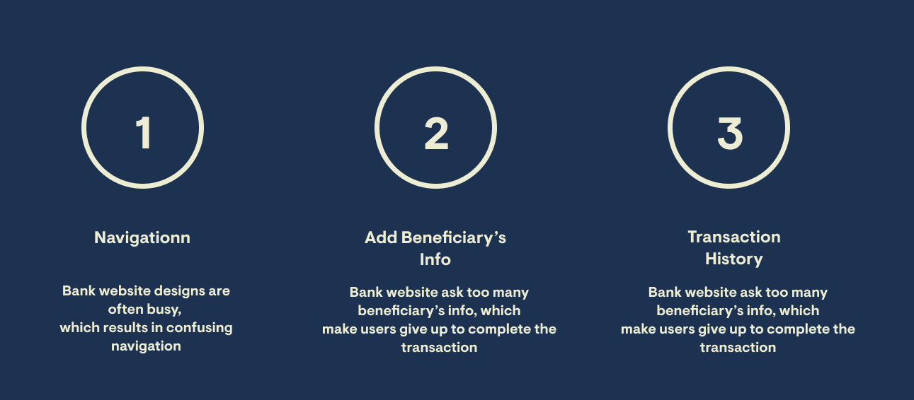
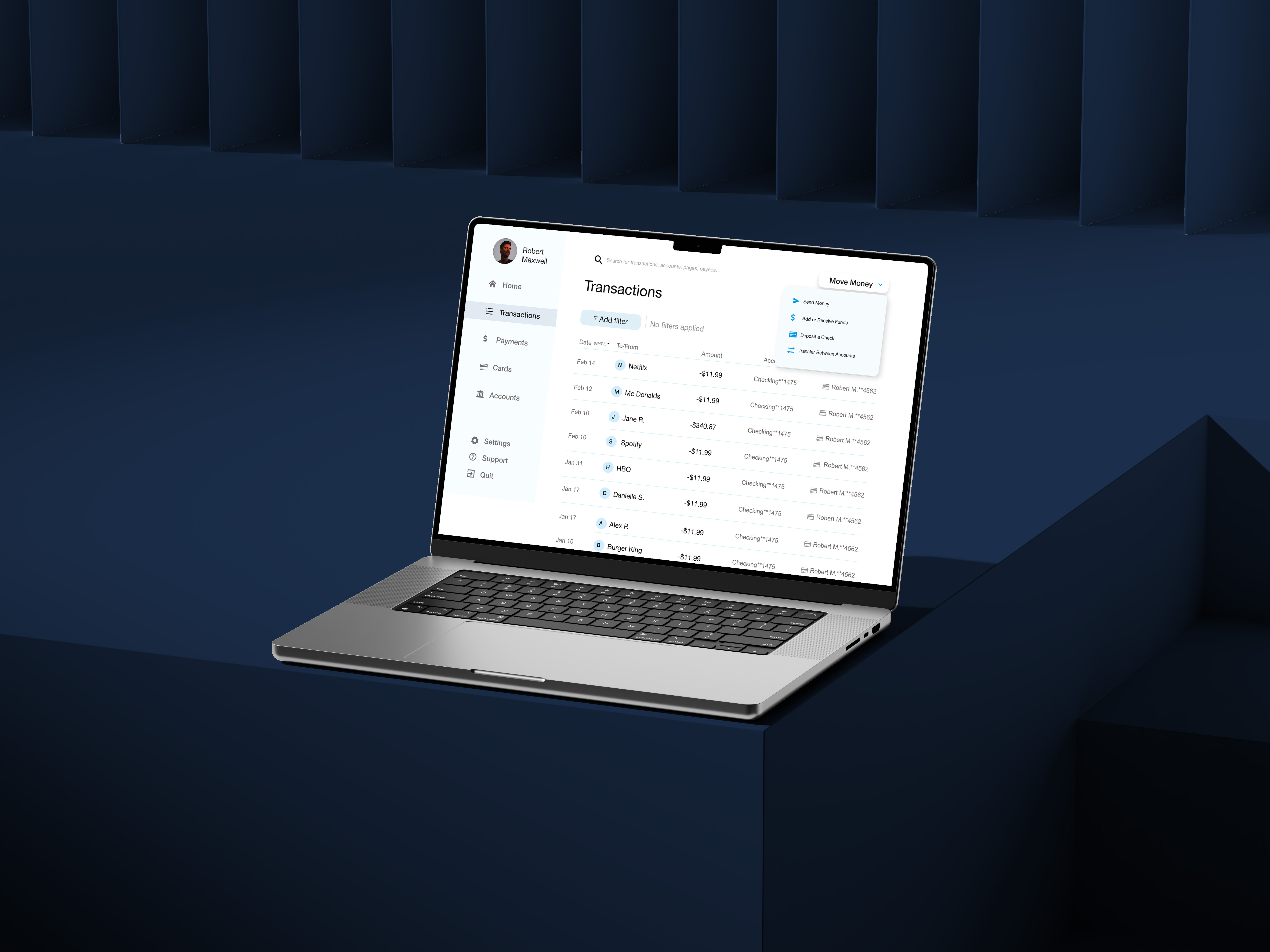
Existing bank online’s experience require a lot of information while adding new beneficiary, don’t provide a simple and easy navigation. They also don’t provide transaction history.
The goal
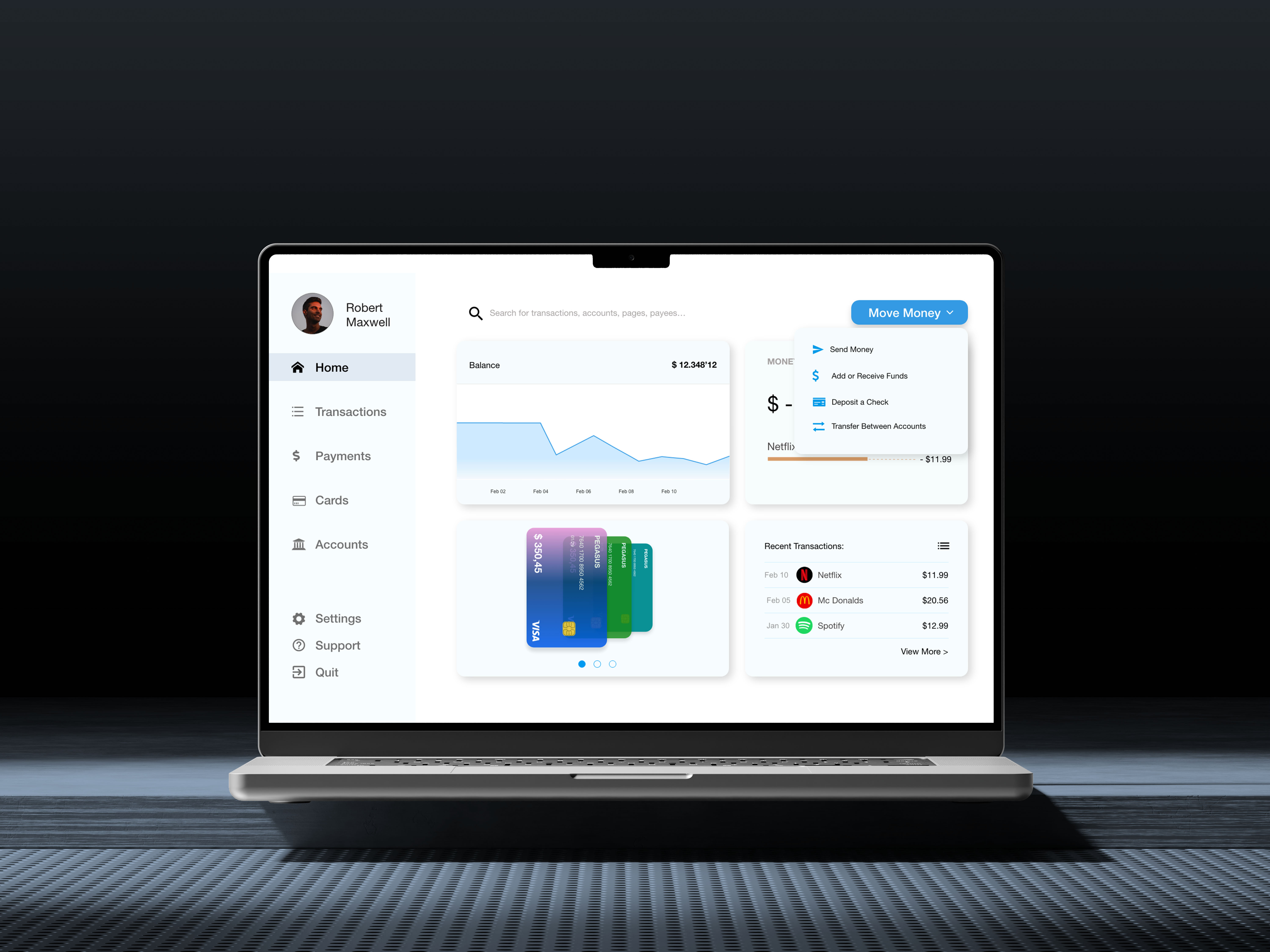
Design a bank Pegasus website to be user friendly by providing clear navigation, less beneficiary info, and transaction history.
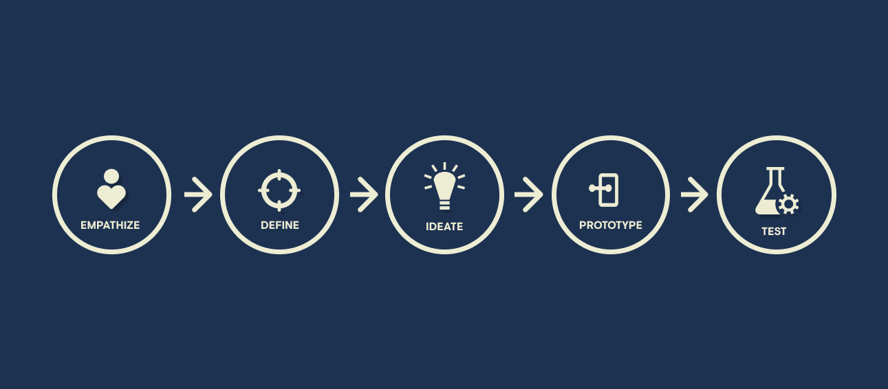
Design process
User research
Summary
I conducted user interviews, which I then turned into empathy maps to better understand the target user and their needs. I discovered that many target users want to manage their money from anywhere, from university or work. However, many bank websites are overwhelming and confusing to navigate, which frustrated many target users. This caused a normally enjoyable experience to become challenging for them.
Pain points
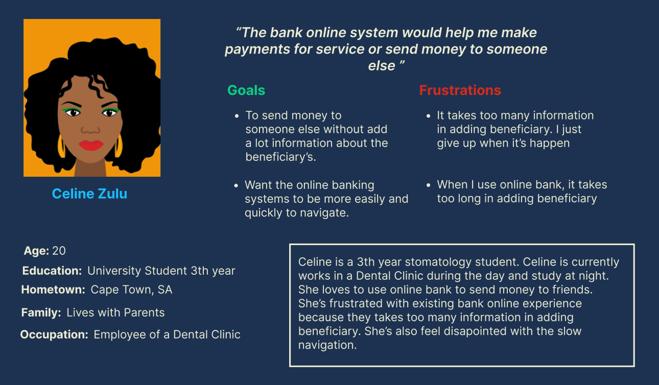
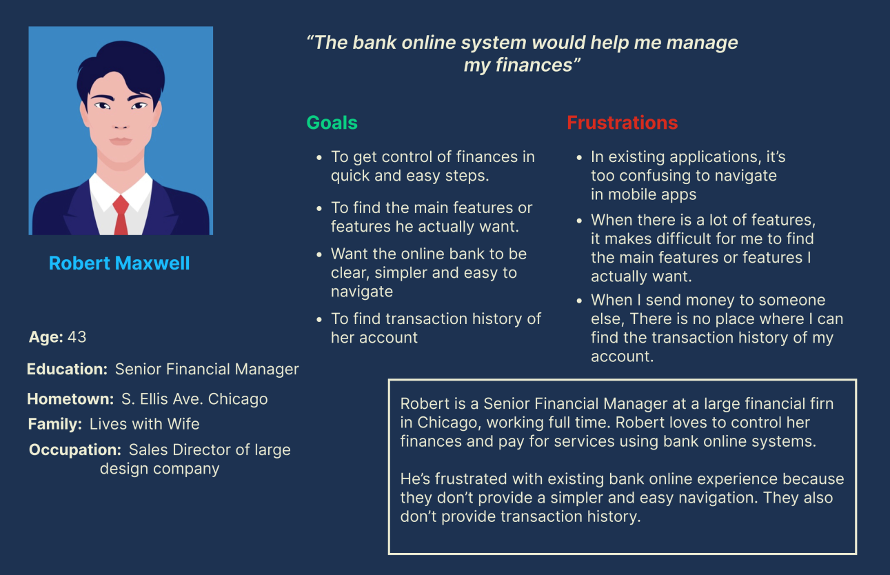
Personas
User journey map
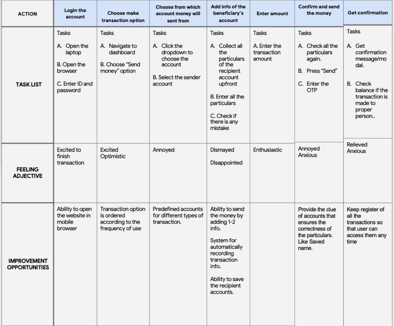
I created a user journey map of Pegasus’s experience using the site to help identify possible pain points and improvement opportunities.
Problem statement
Celine is a Stomatology student and busy stomatologist who needs a quick and easy way to send money to her friends or someone else because She doesn't have time to go to the bank or ATM in person
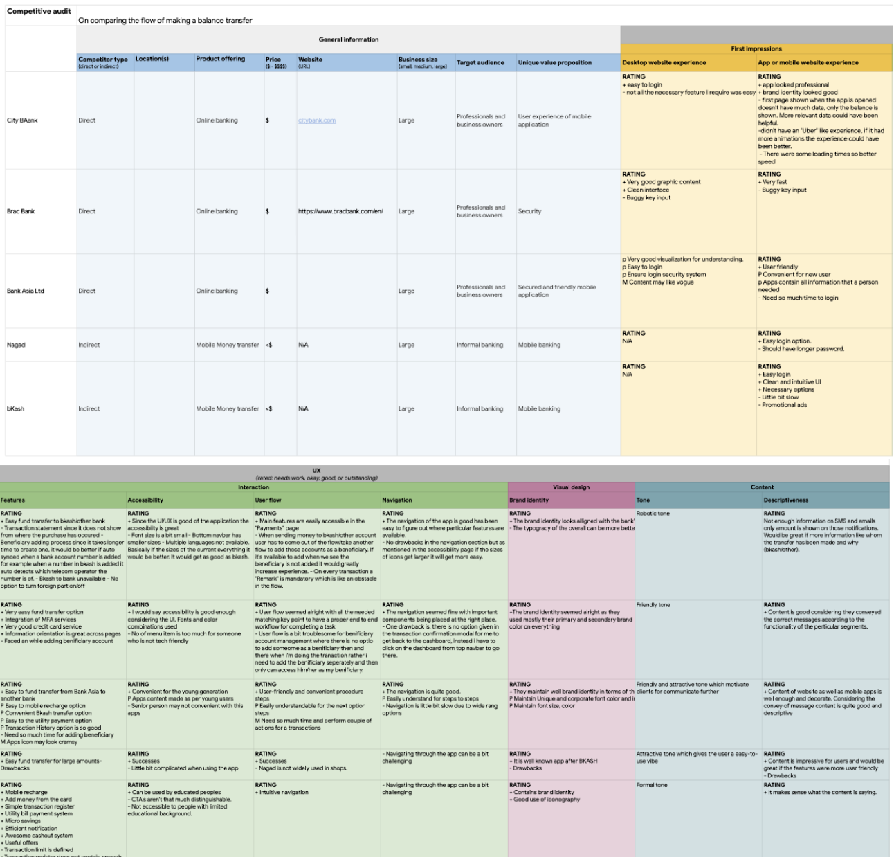
Competitive audit
Sitemap
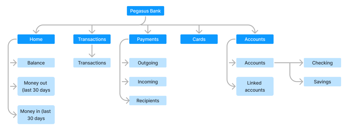
Difficulty with website navigation was a primary pain point for users, so I used that knowledge to create a sitemap.
My goal here was to make strategic information architecture decisions that would improve overall website navigation. The structure I chose was designed to make things simple and easy.
Starting the design
Paper wireframes
I sketched out paper wireframes for each screen in my app, keeping the user pain points about navigation, add new beneficiary, and find transaction history.
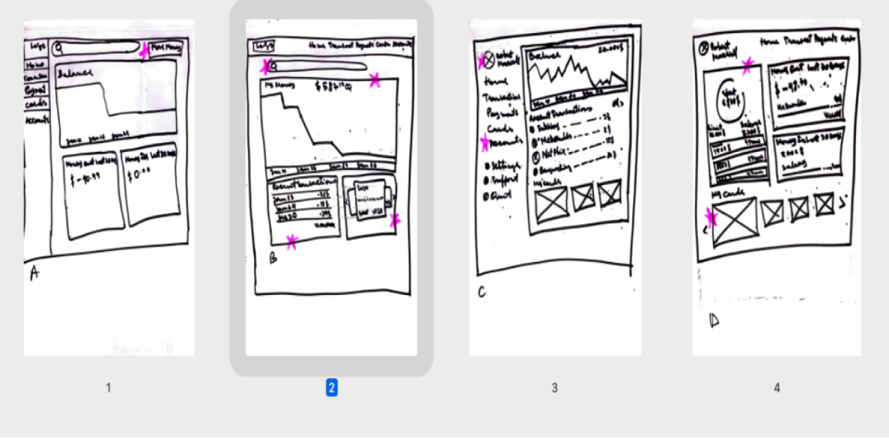
Paper wireframes screen size variations
Because Pegasus’s customers access the site on a variety of different devices, I started to work on designs for additional screen sizes to make sure the site would be fully responsive.
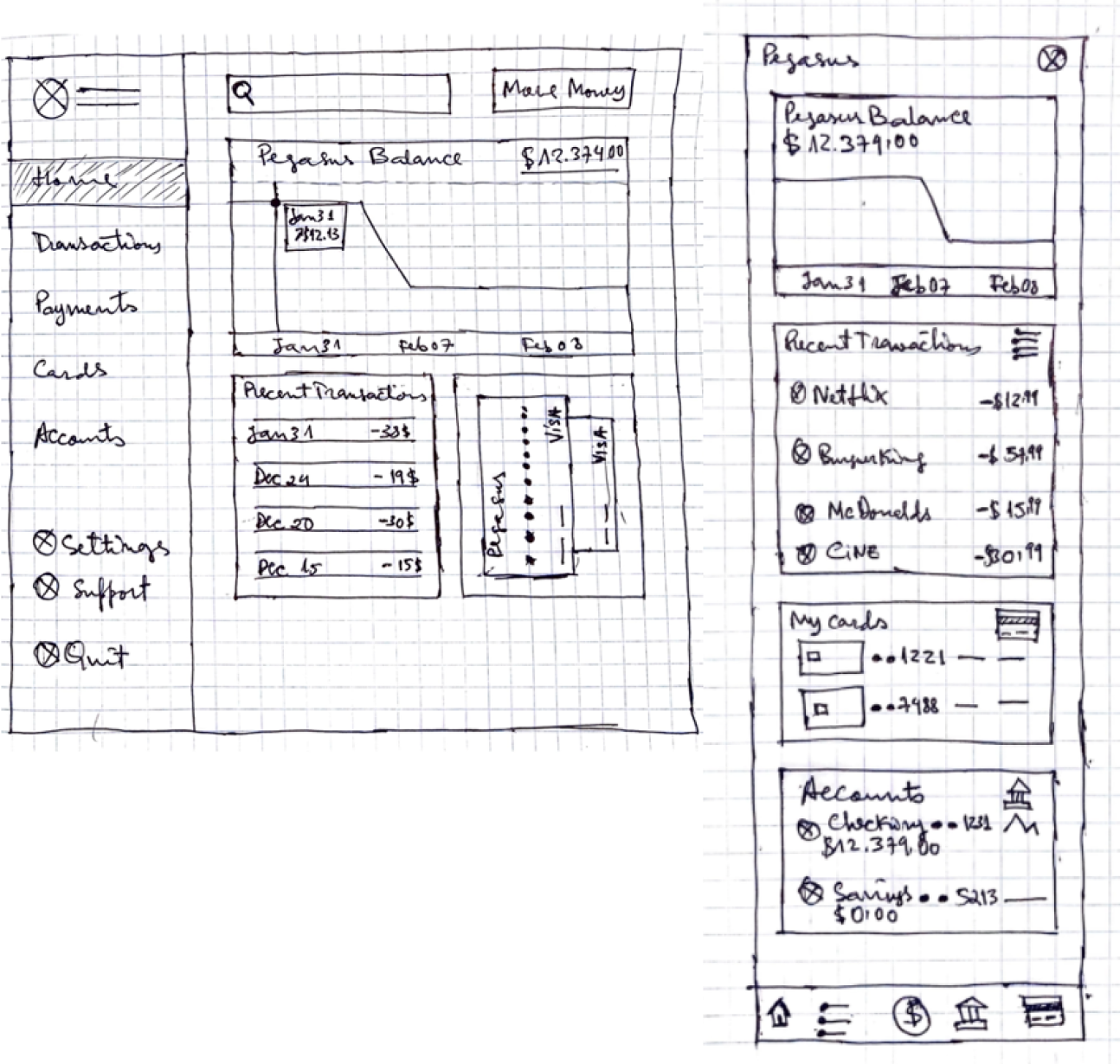
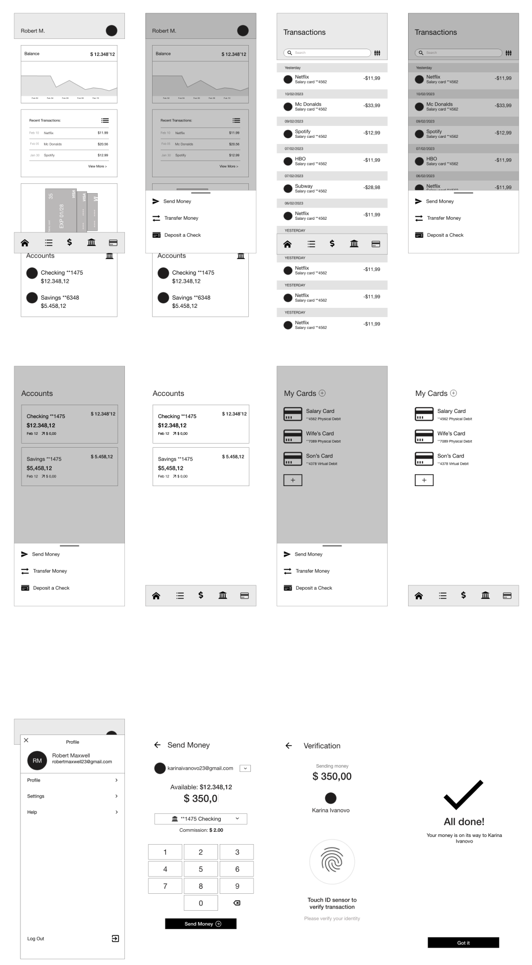
Digital wireframes
After ideating and drafting some paper wireframes, I created the initial designs for the Find Food app. These designs focused on delivering personalized guidance to users to help order their meal.
Mobile digital wireframes
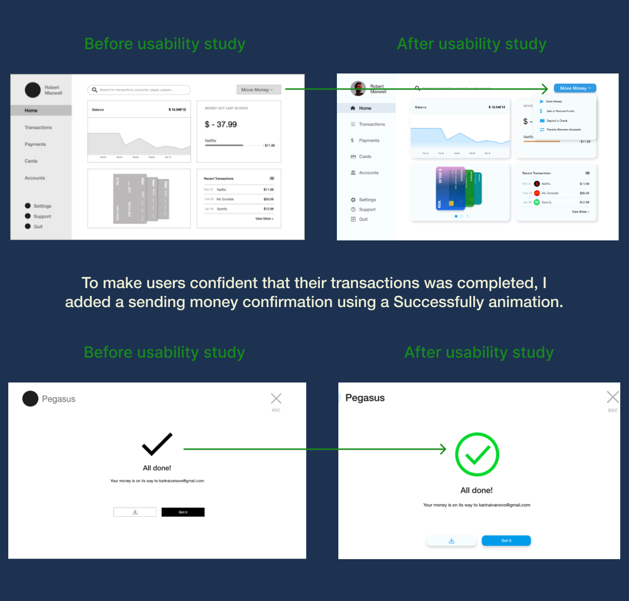
Refining the design
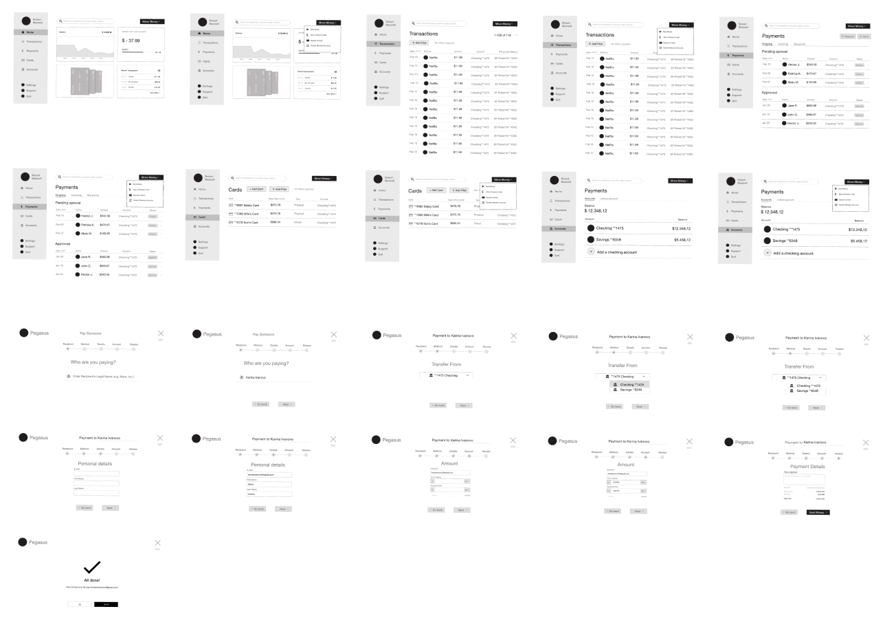
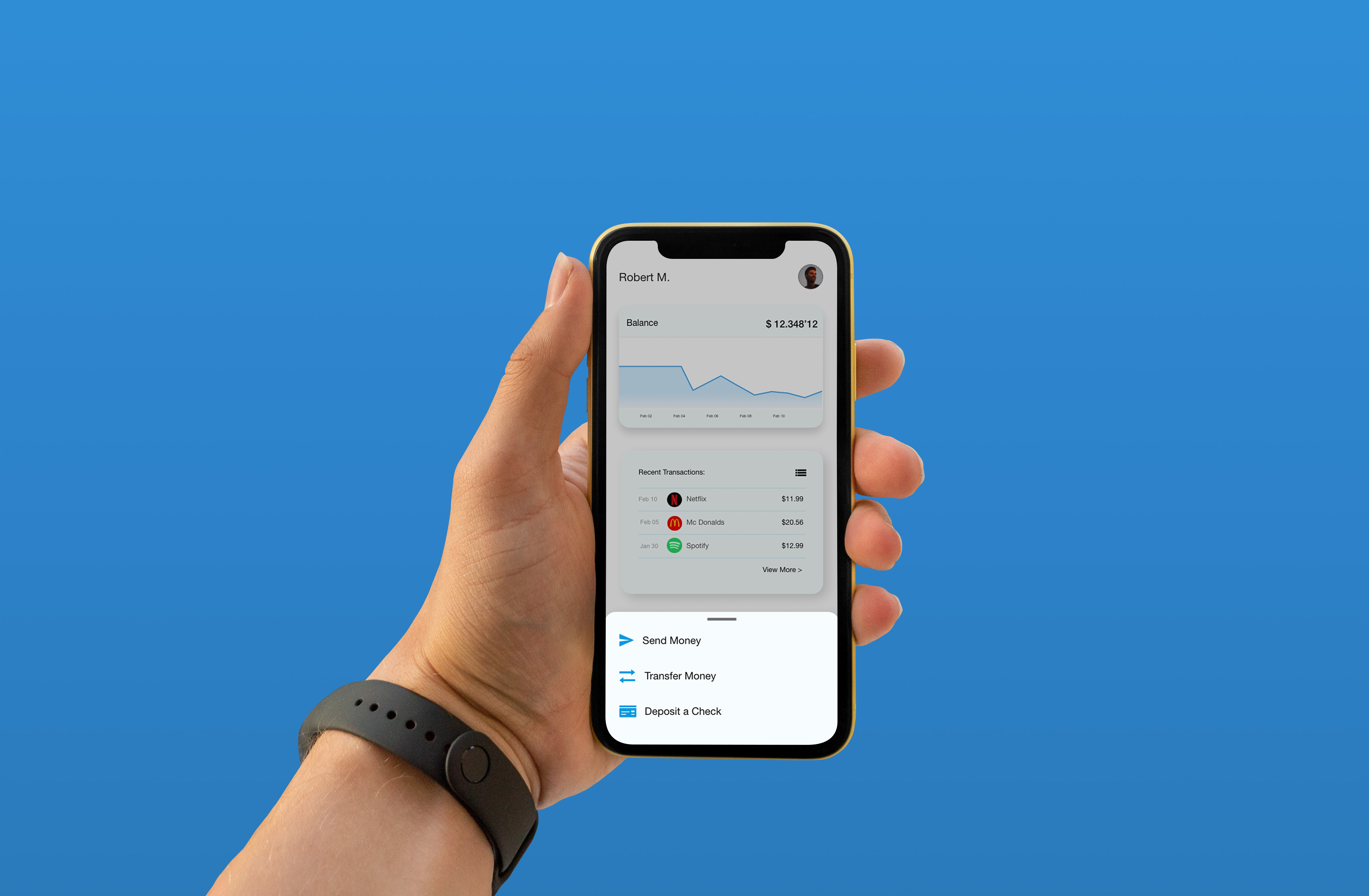
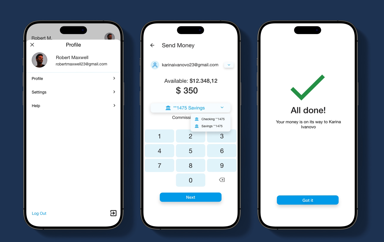
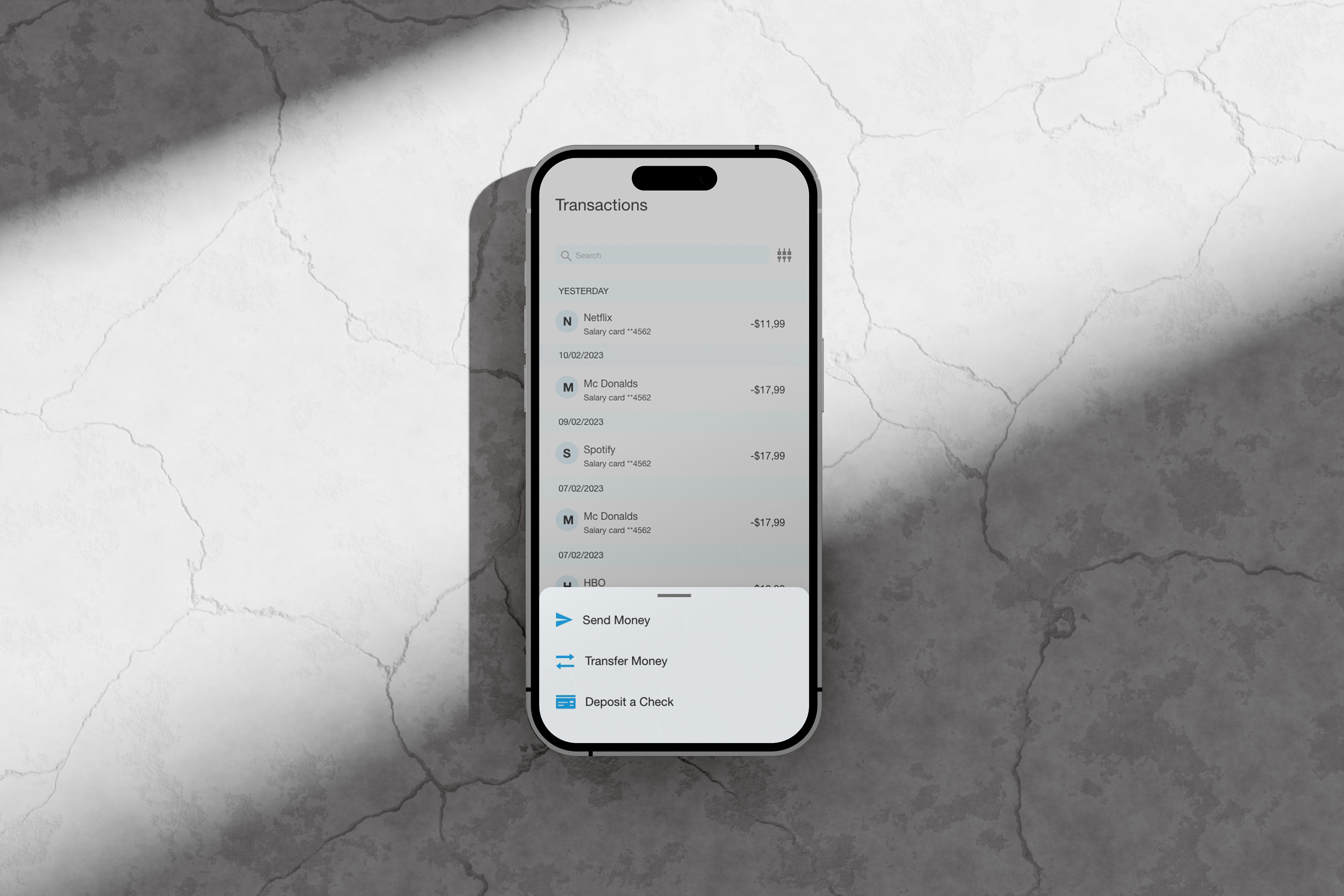
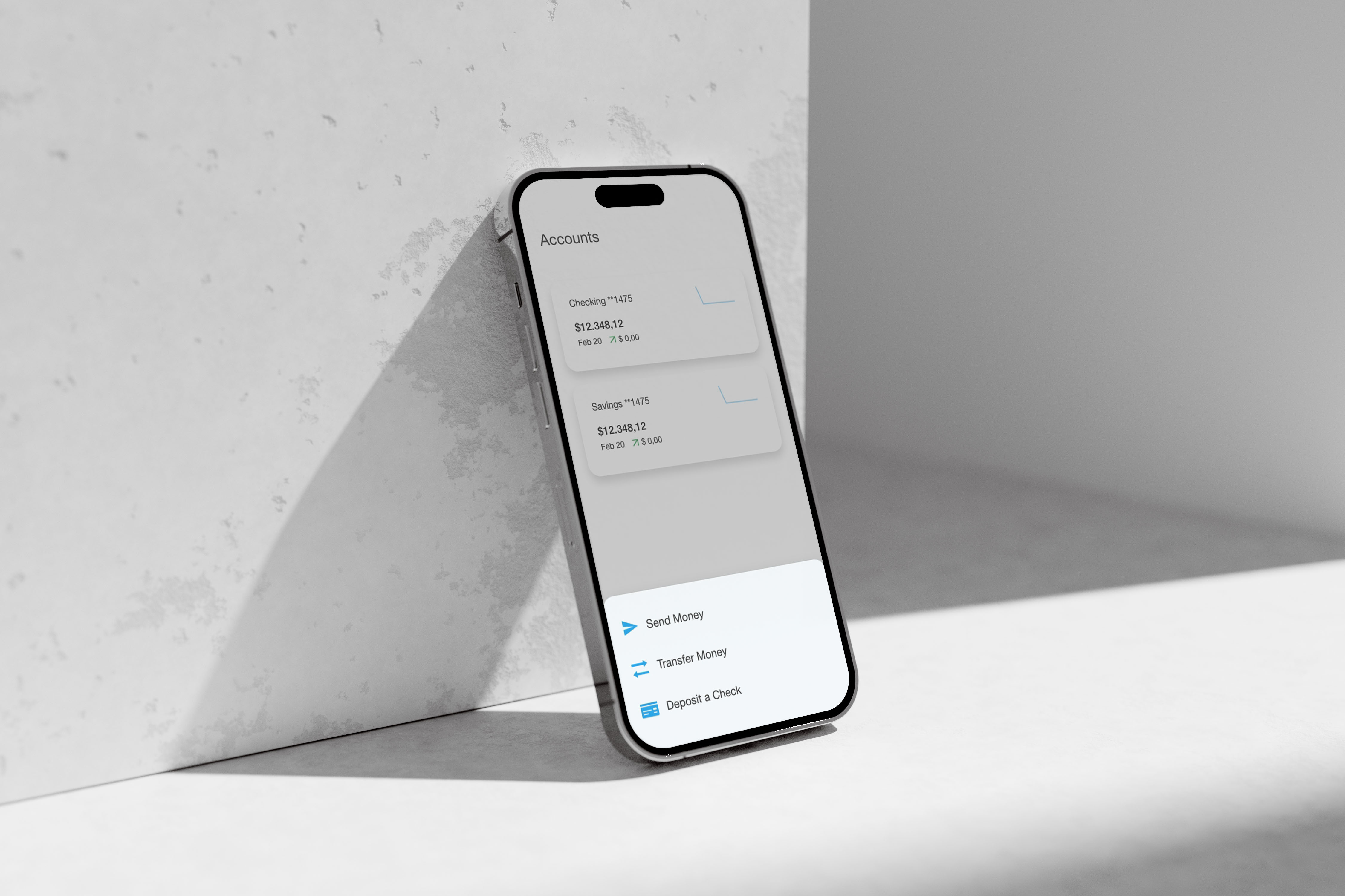
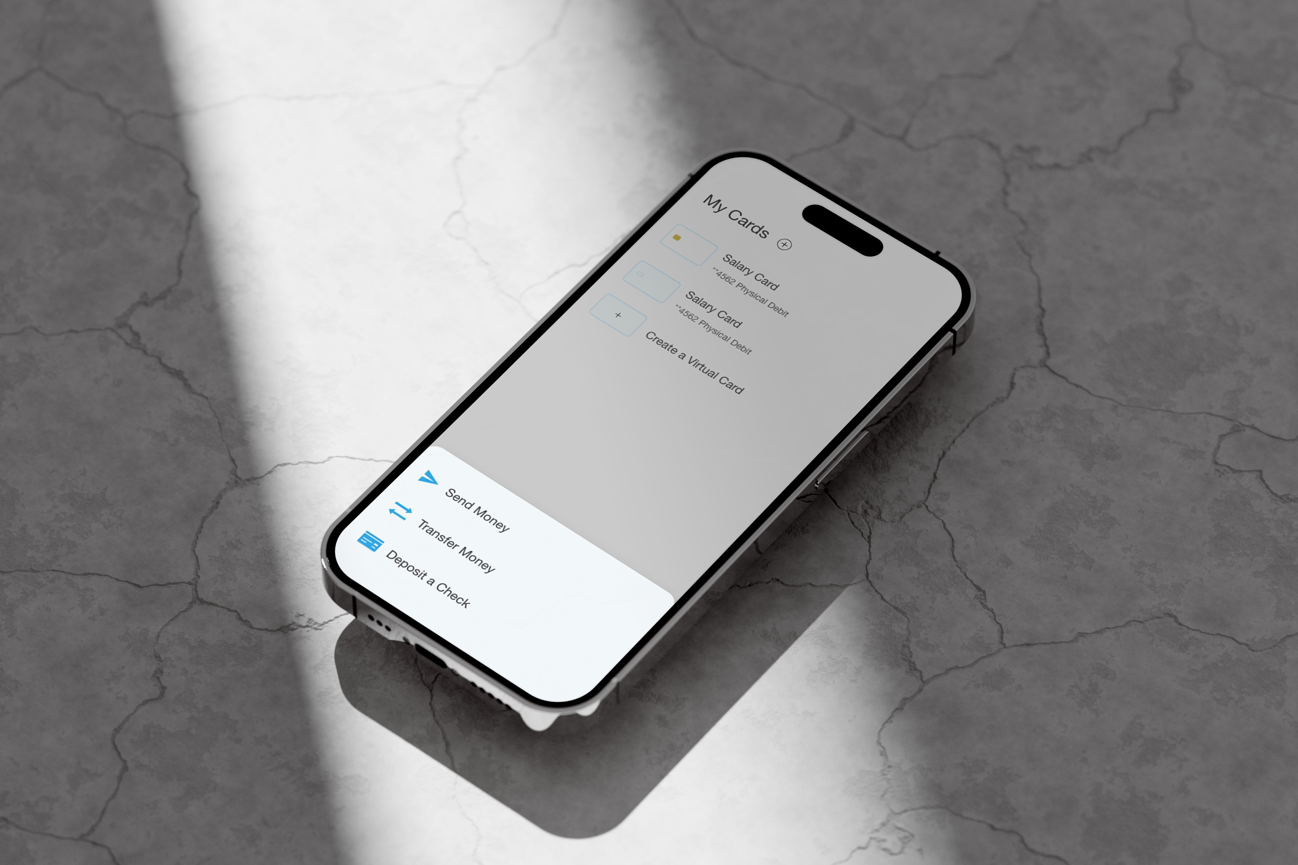
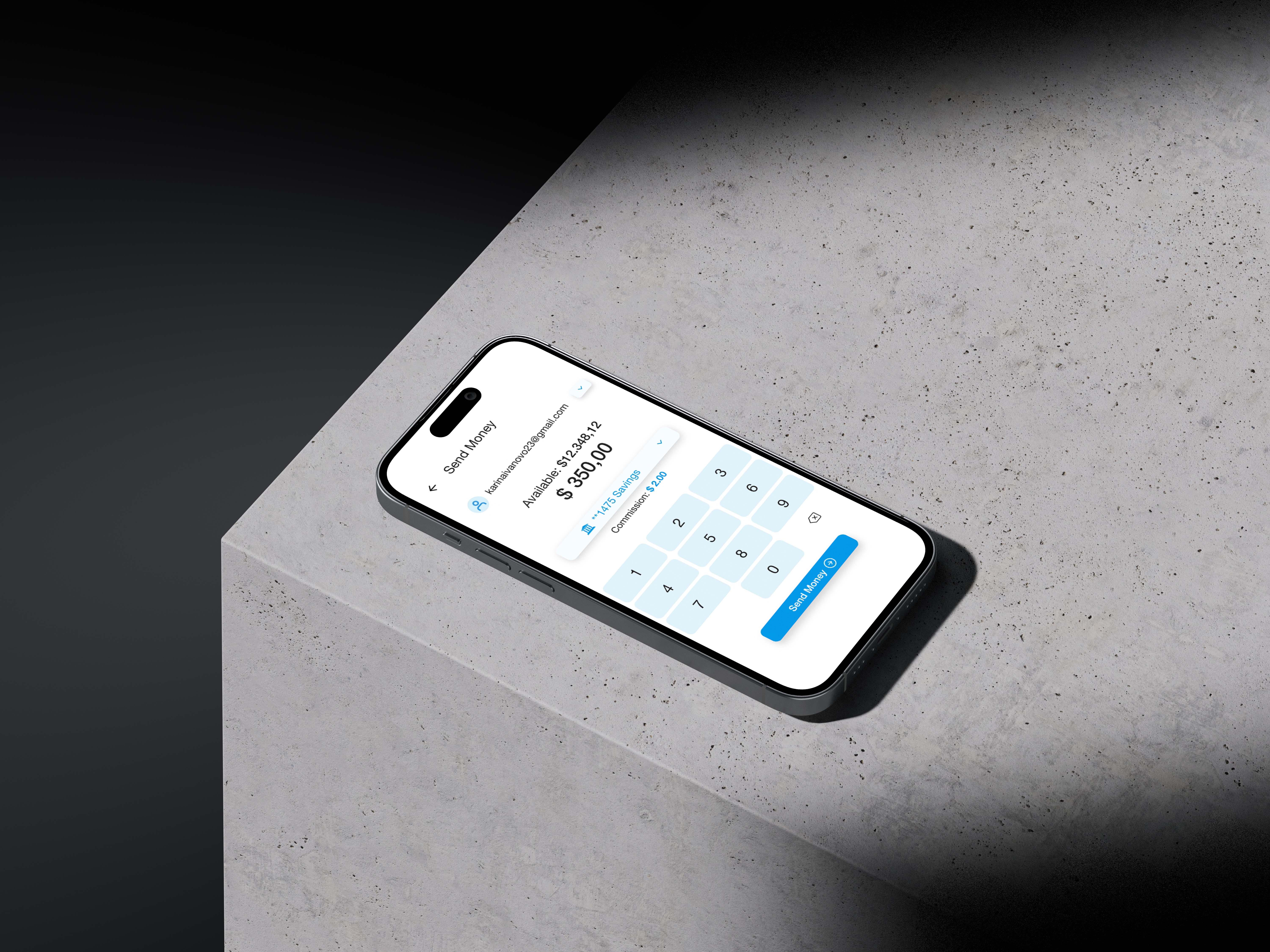
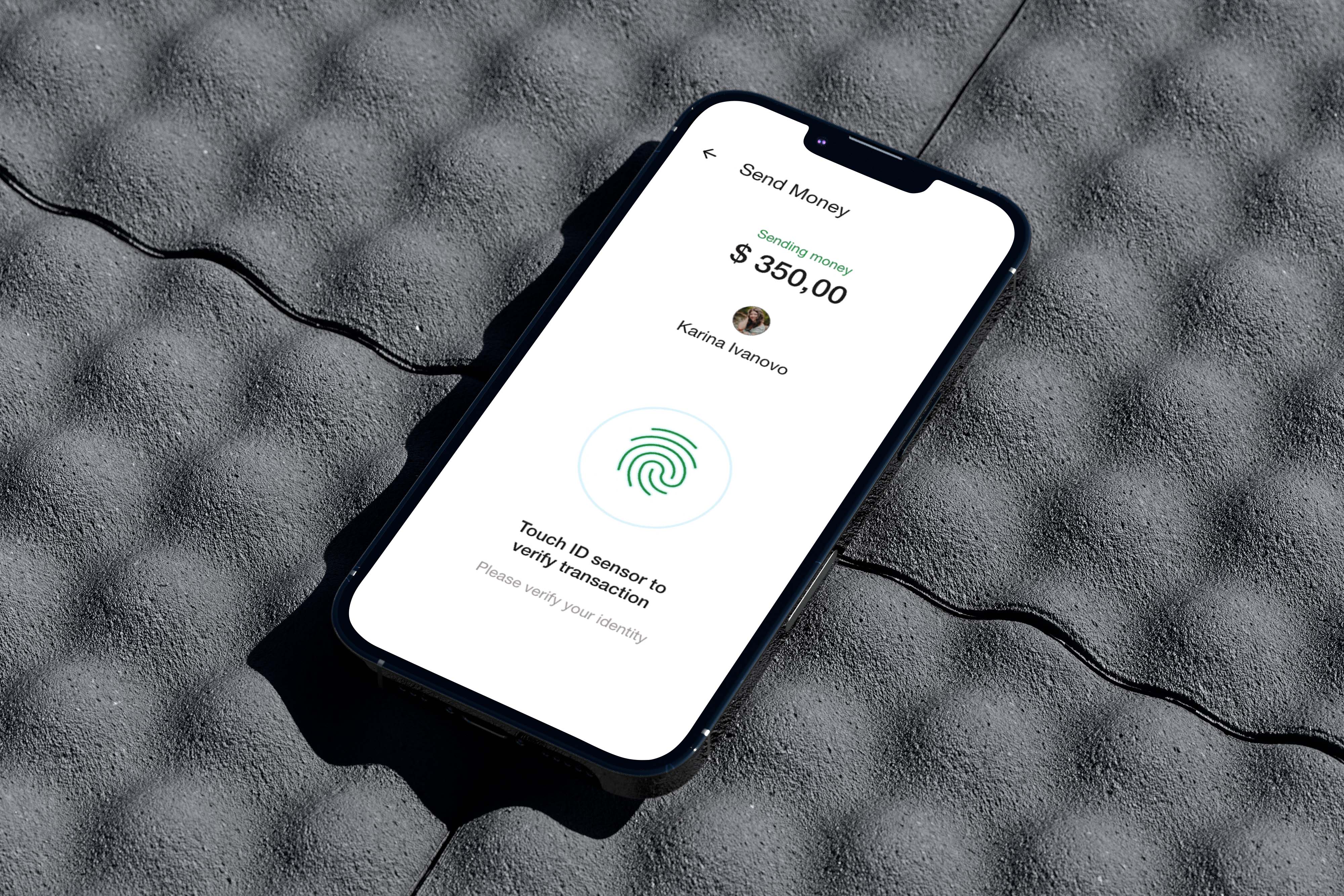
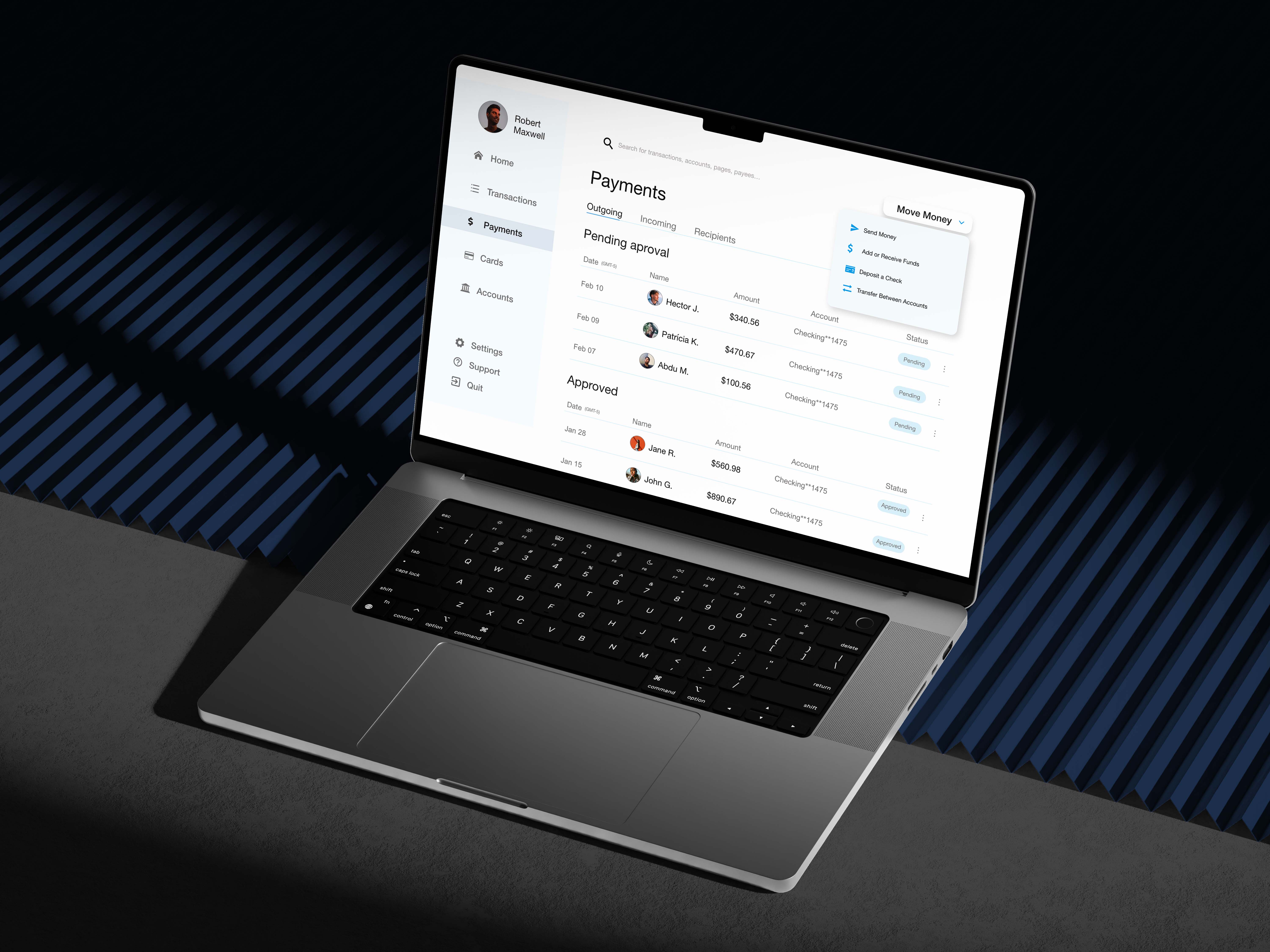
Based on the insights from the usability study, I made changes to improve site’s sending money flow. One of the changes I made was adding color to catch eyes the main function of website. This allowed users find the sending money button easily and quickly.
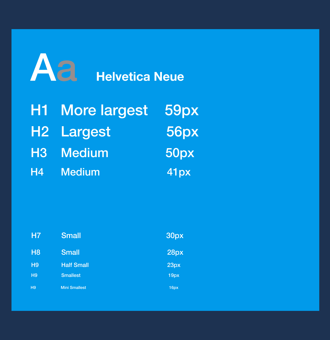
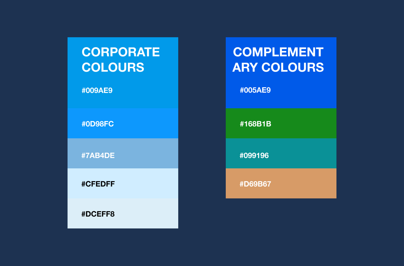
Style guide
Typography
Color
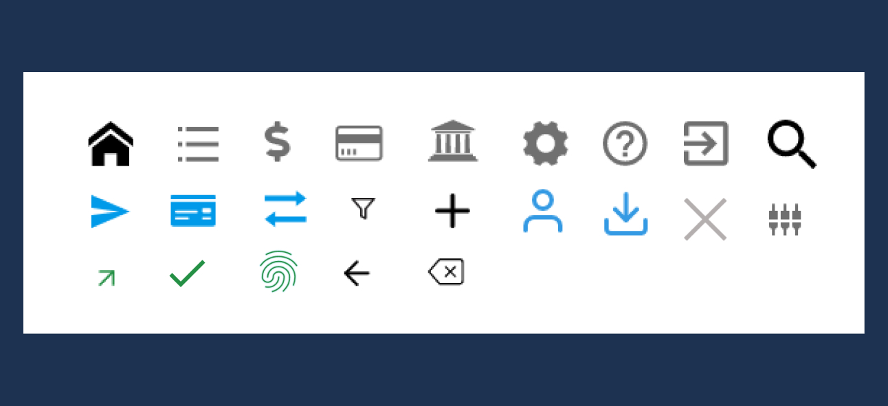
Icon set
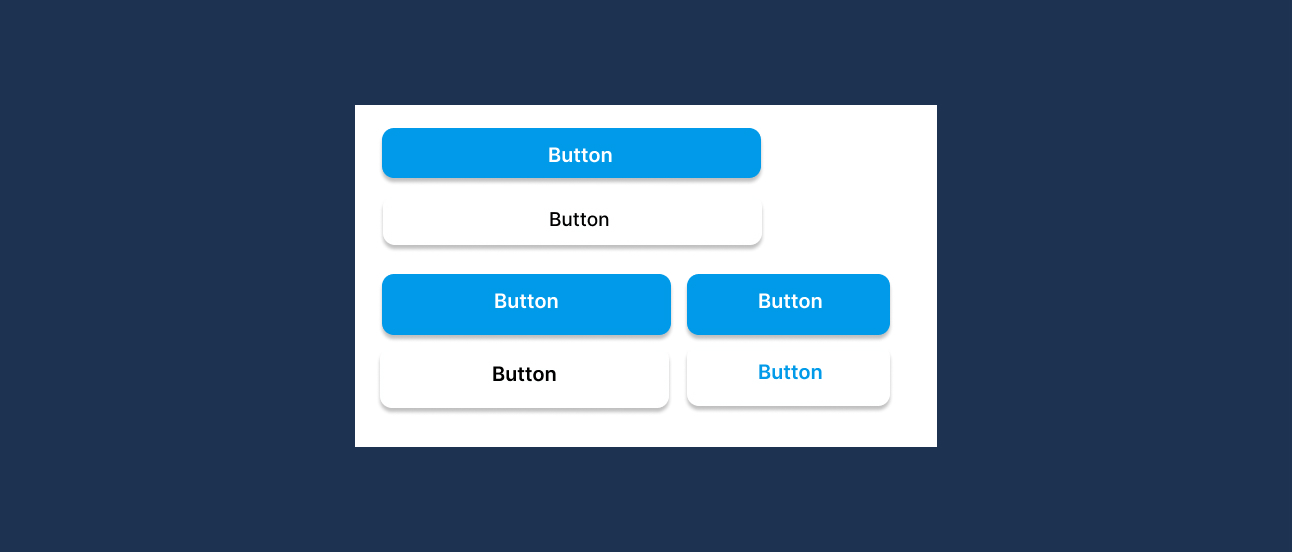
Button
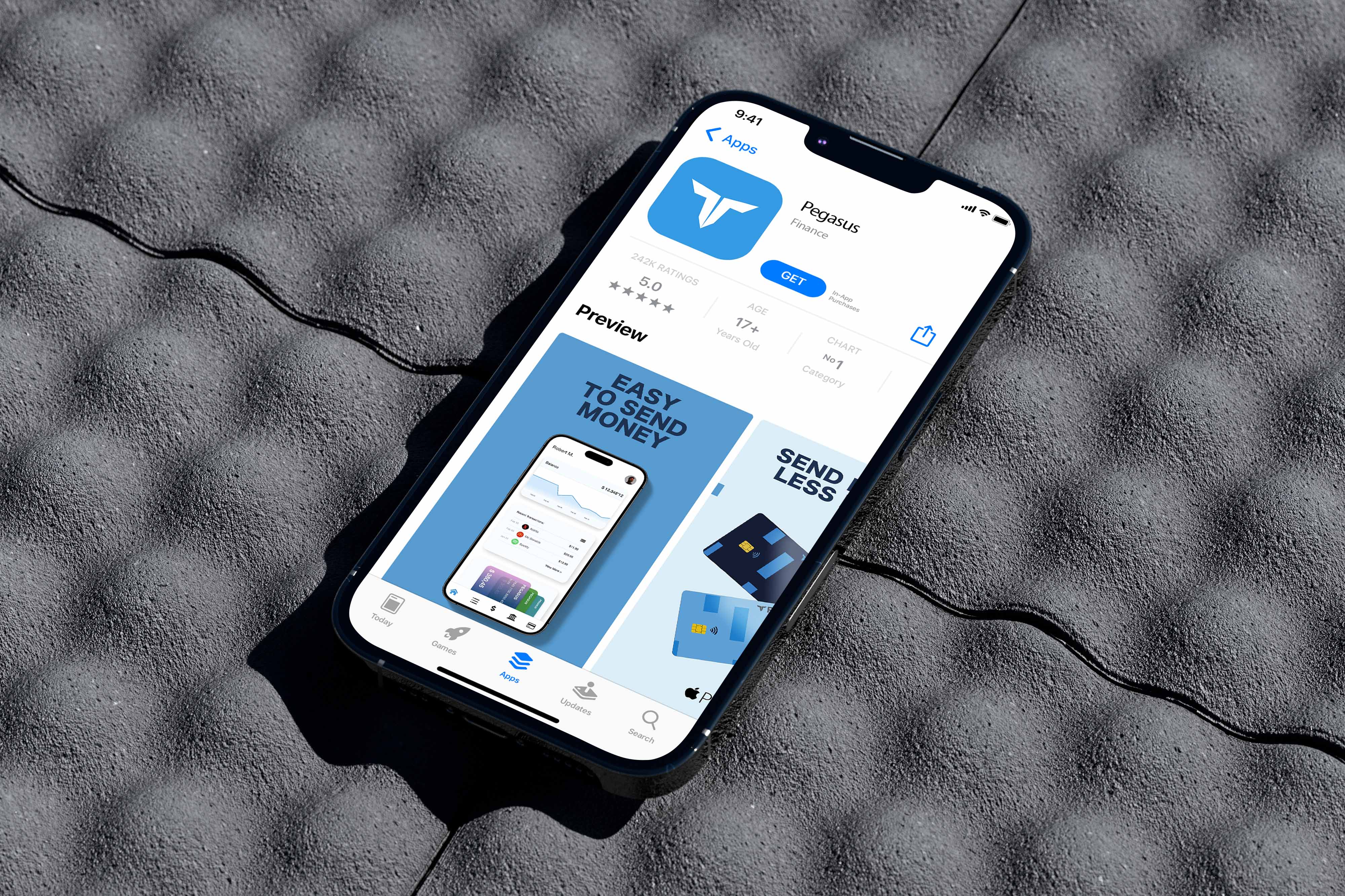
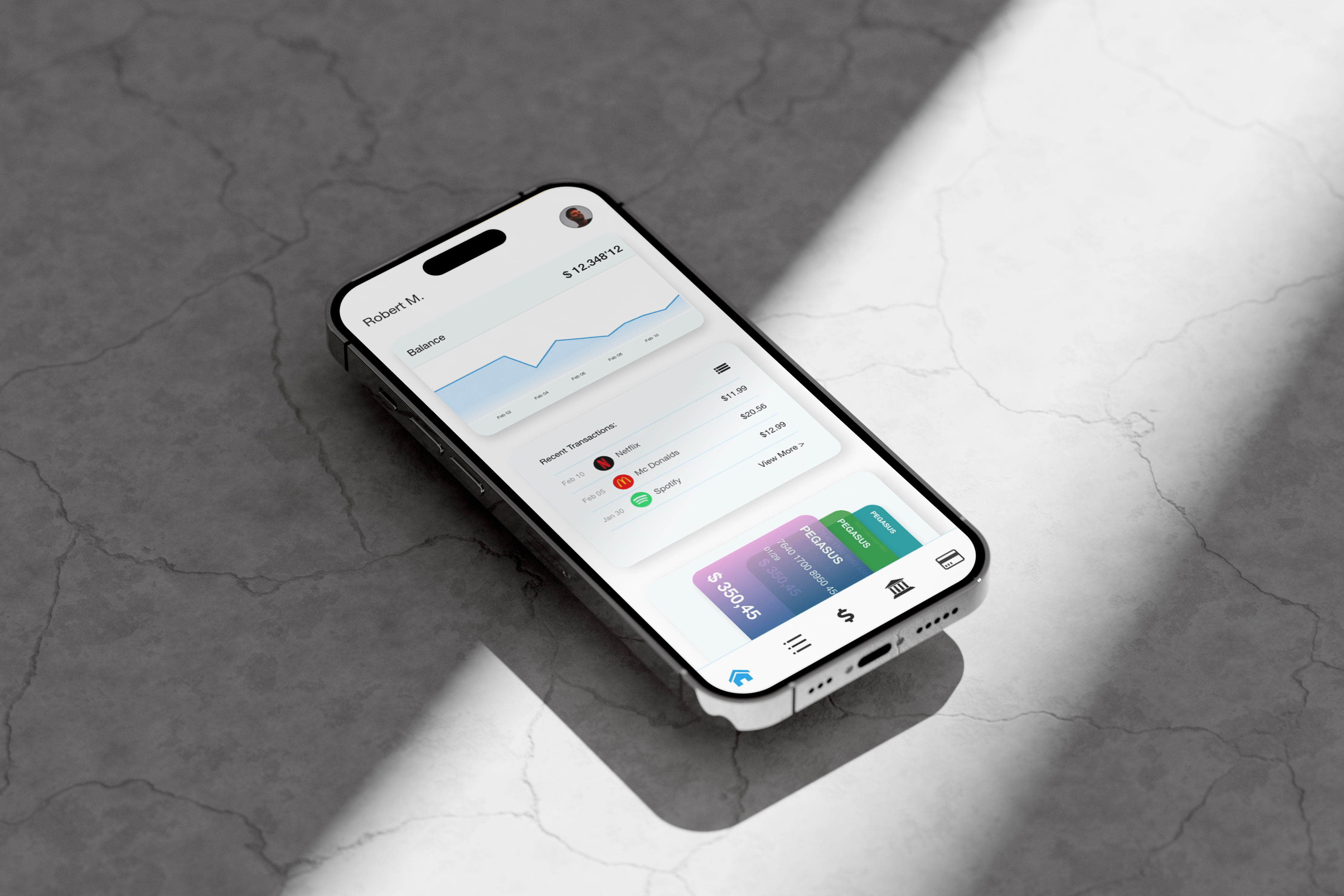
Mockups
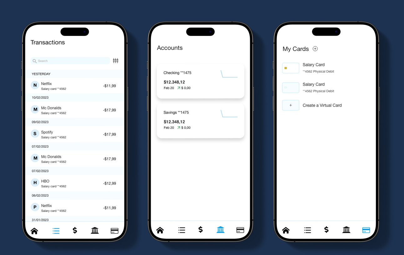
Mobile version

Desktop version
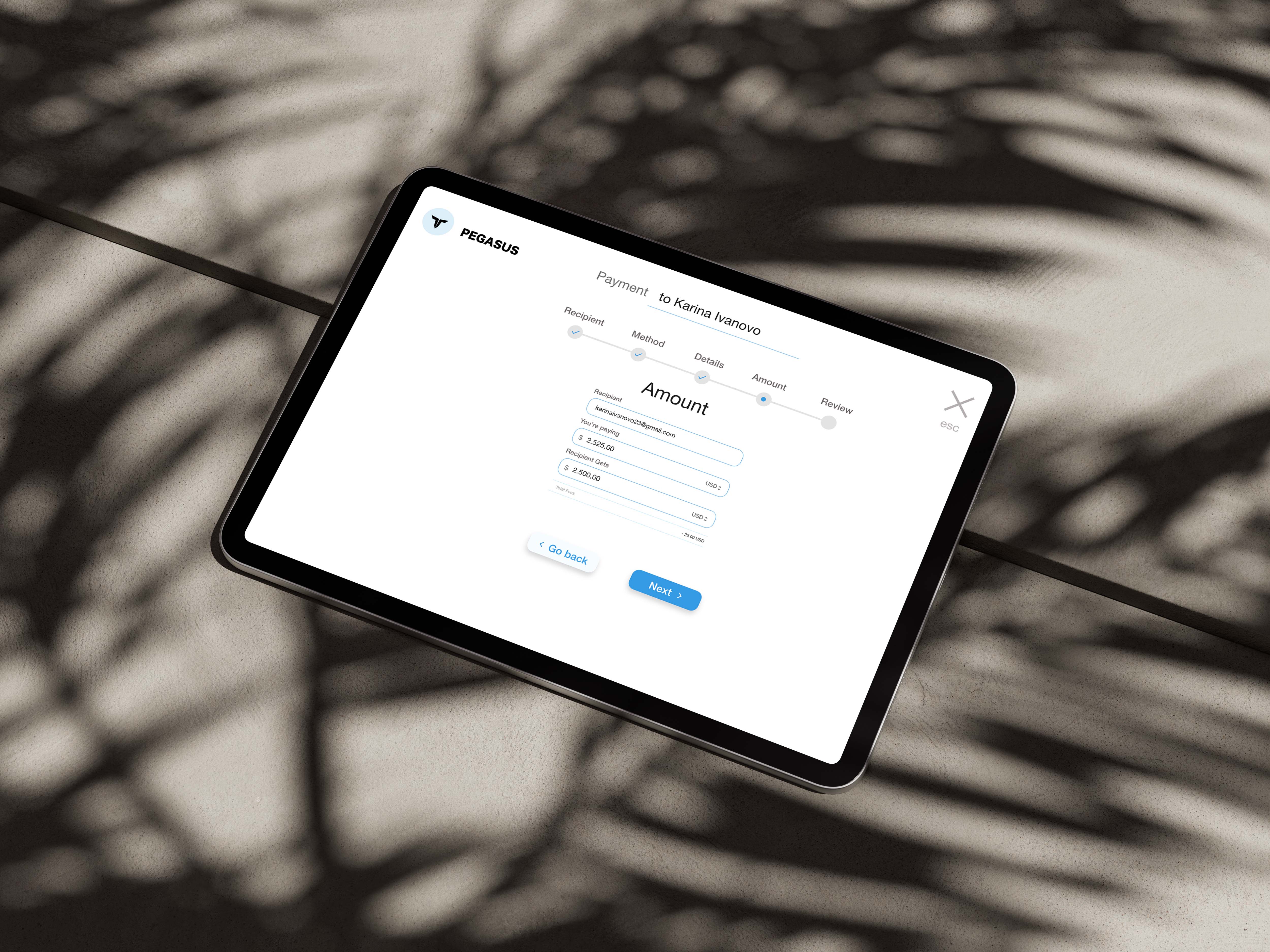
Prototype
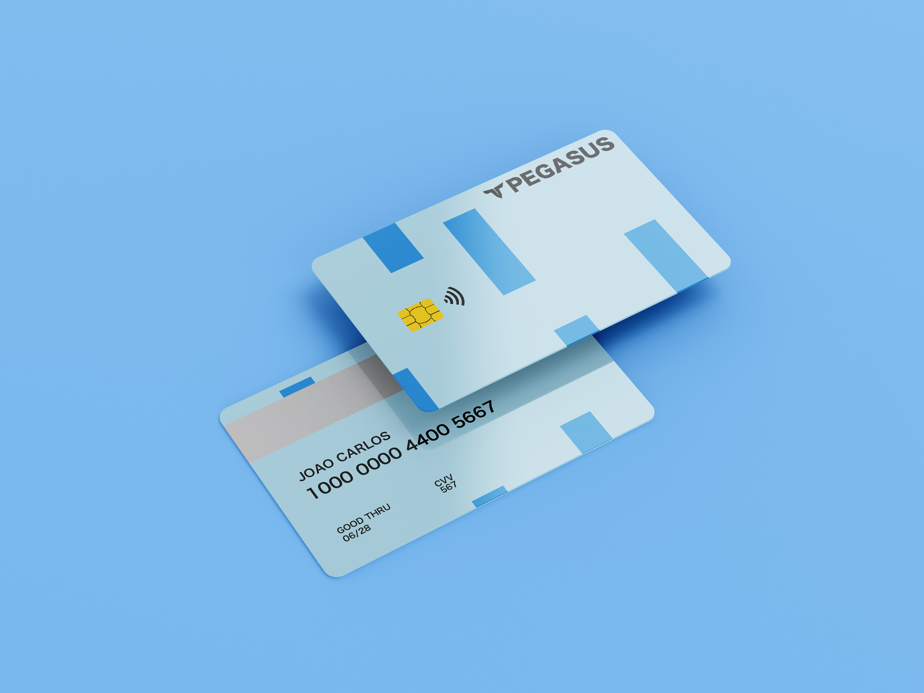
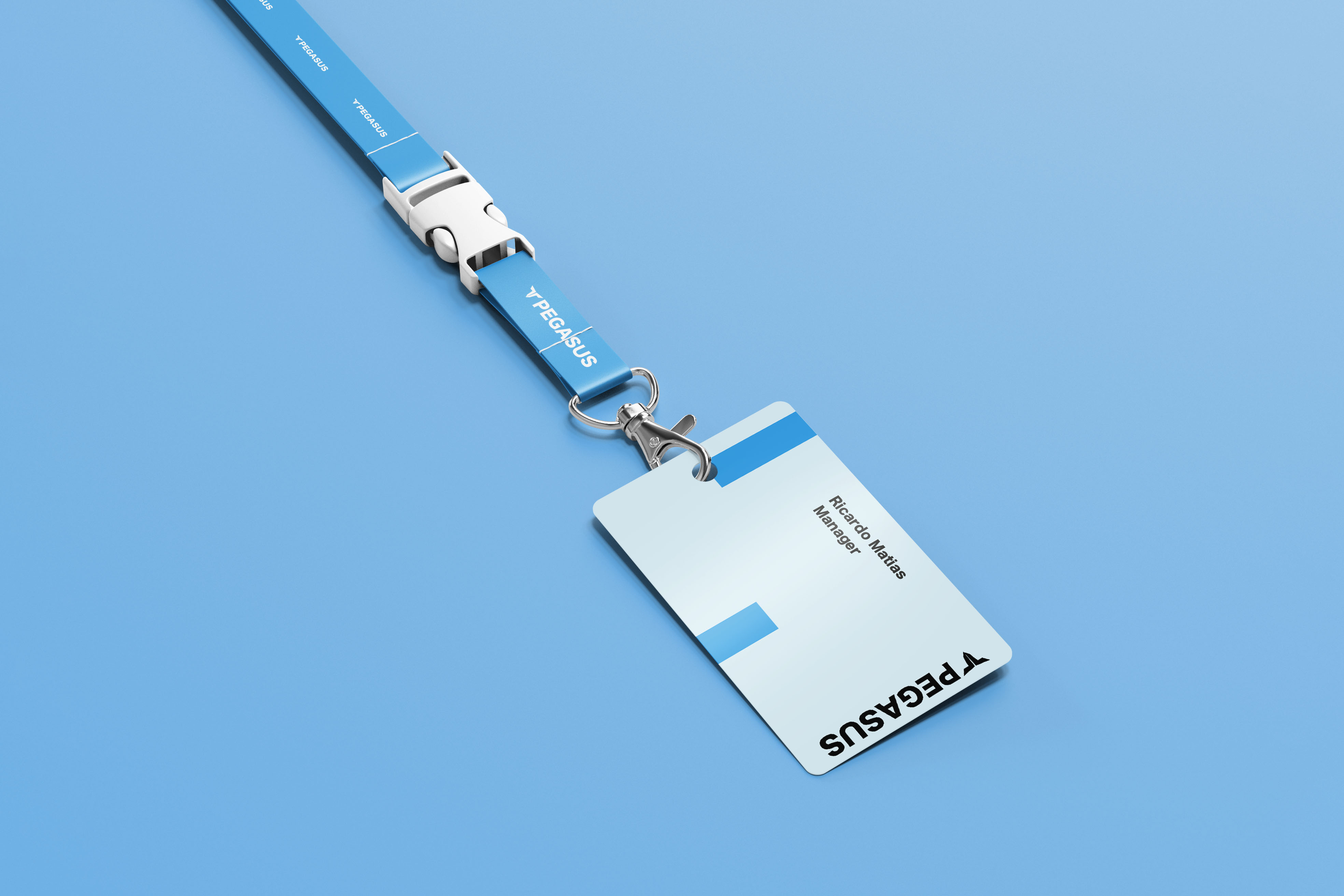
Branding
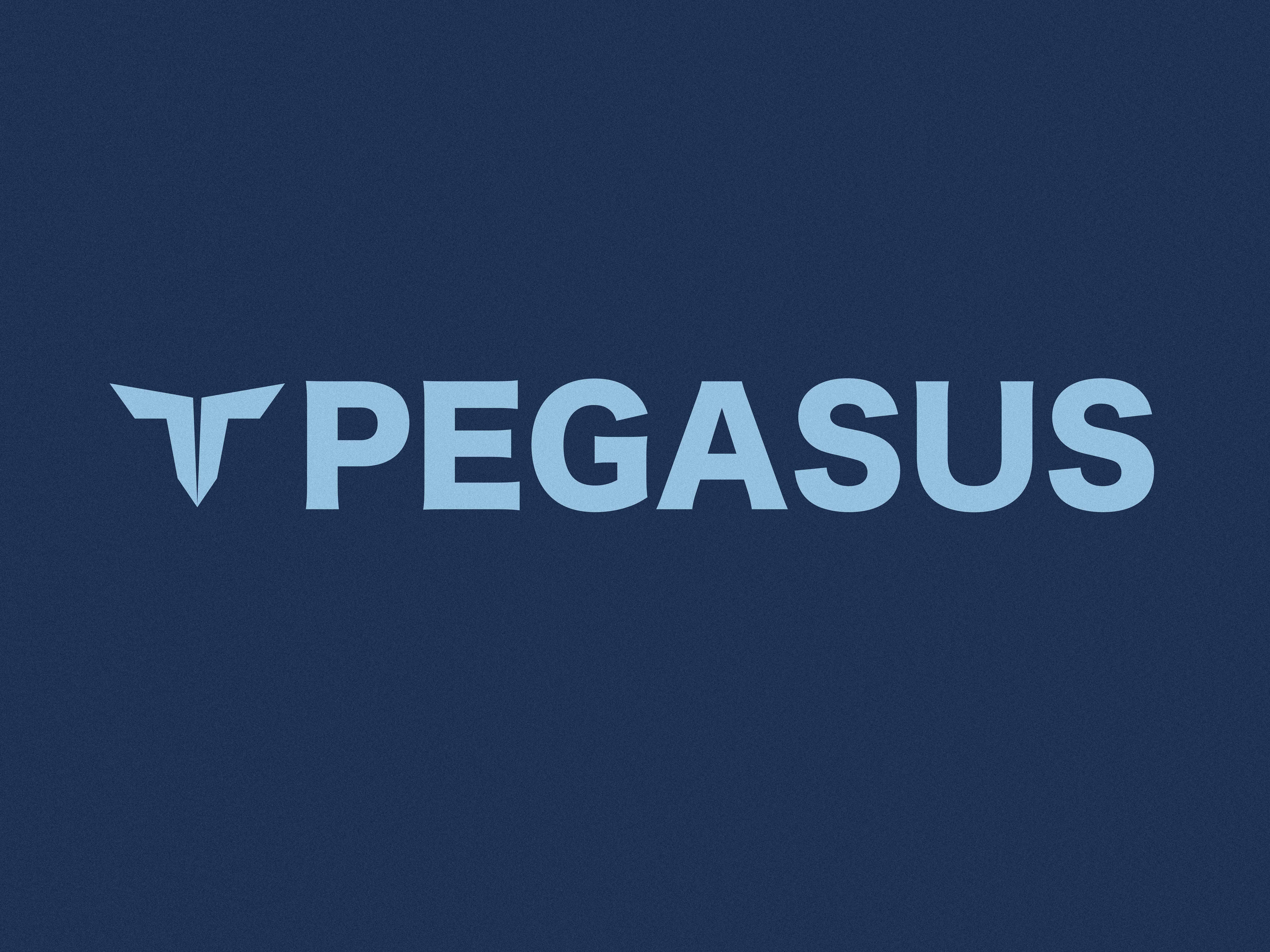
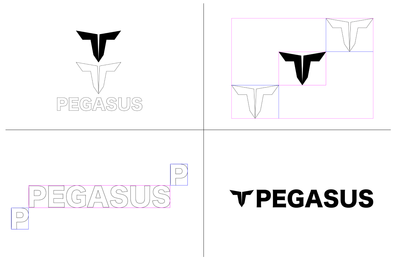
The logo
Our logo is the visual representation of PEGASUS. It is made up of two wings inspired by mythical figure Pegasus a winged horse. We can use the symbol individually or the combination of both parts. The following pages outline the principles behind both elements and how to use them to represent PEGASUS.
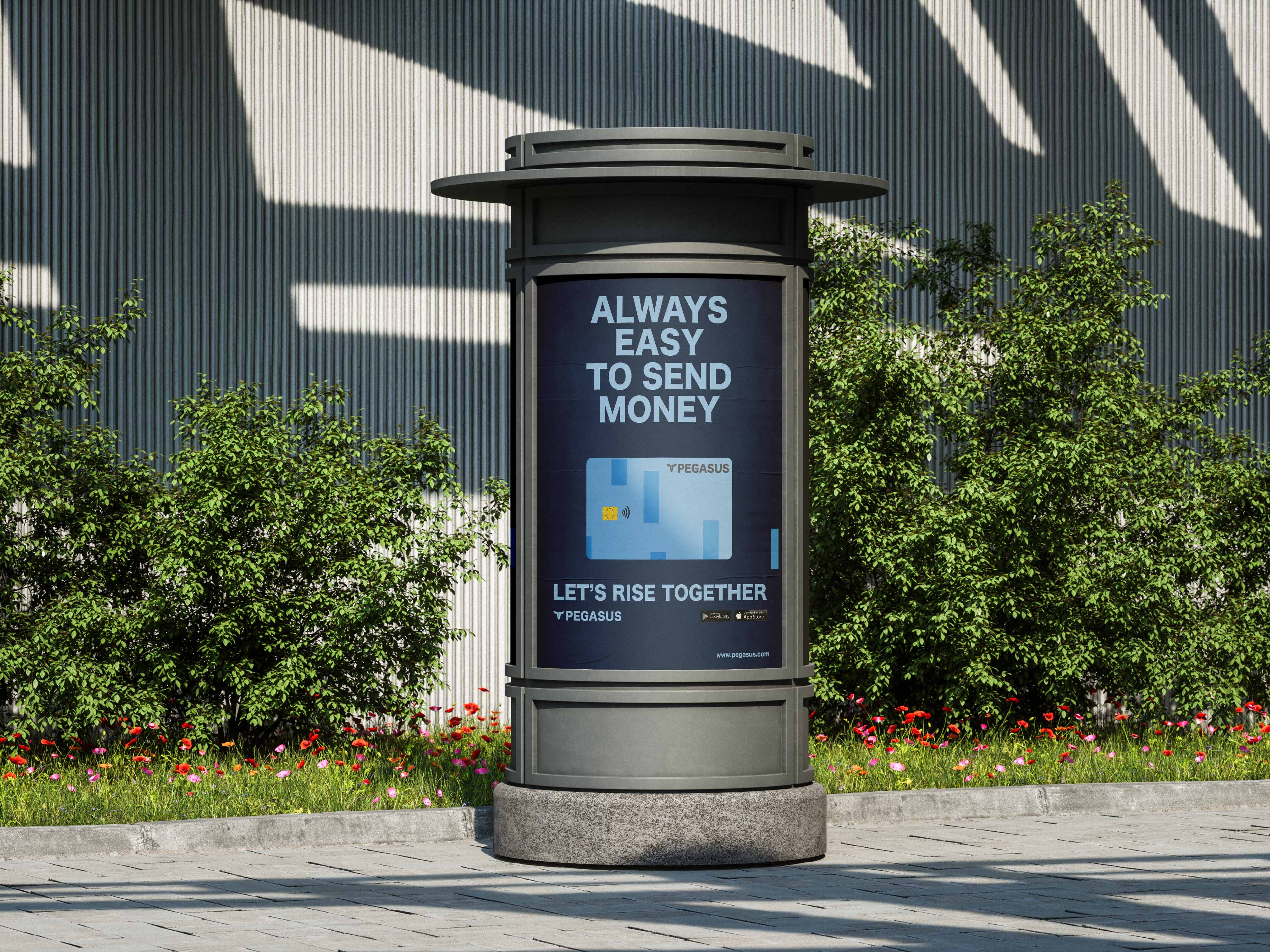
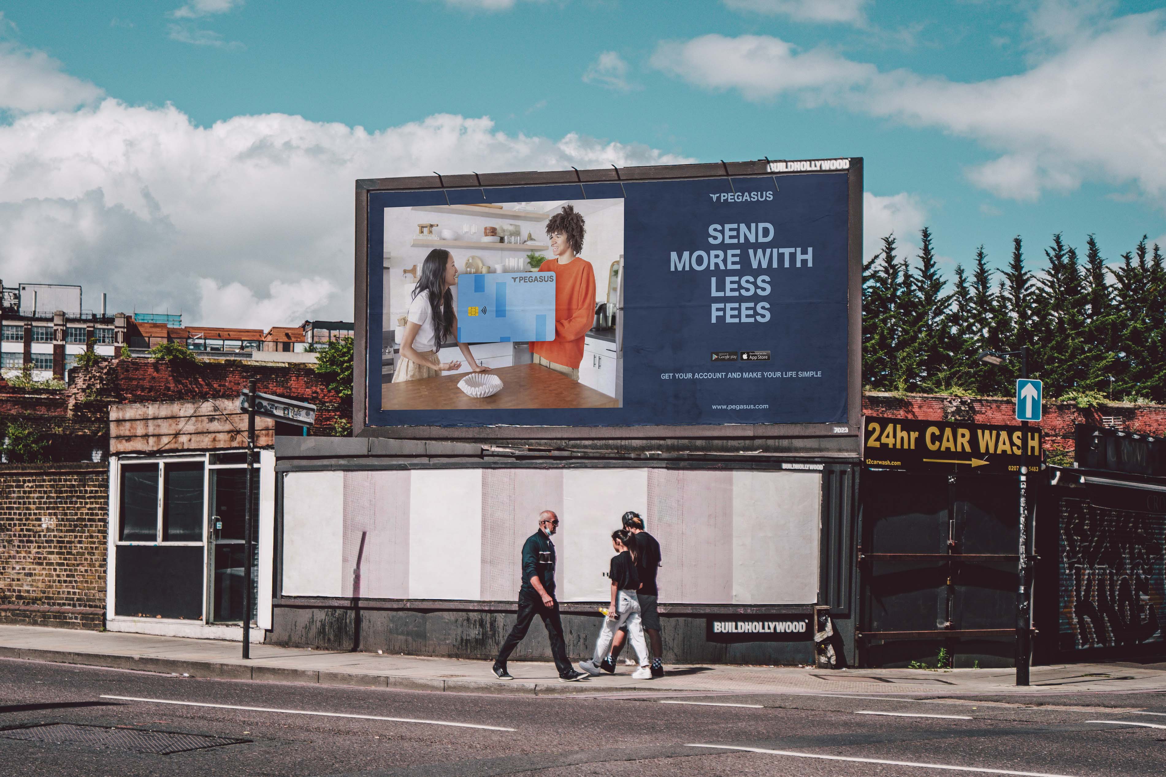
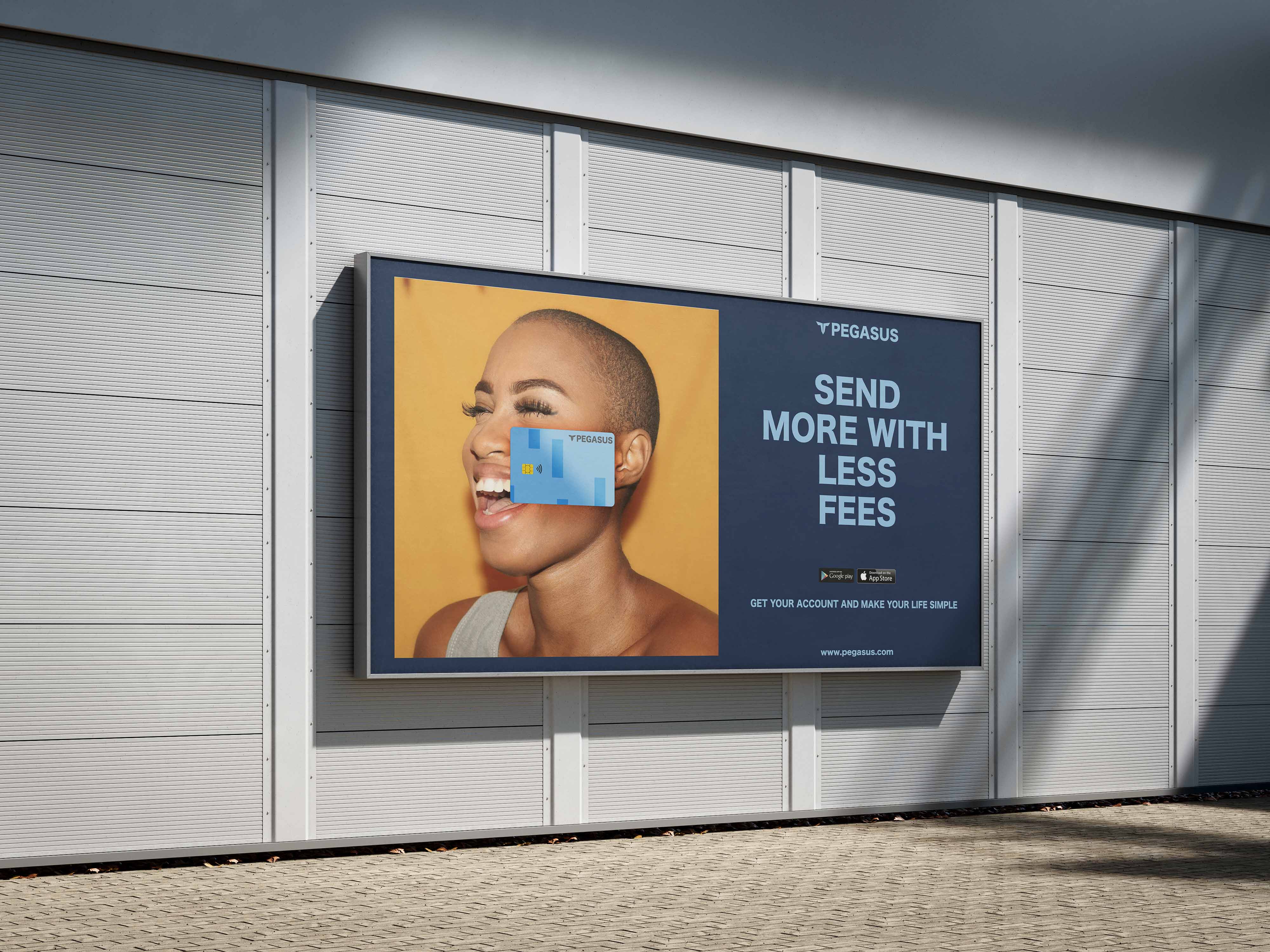
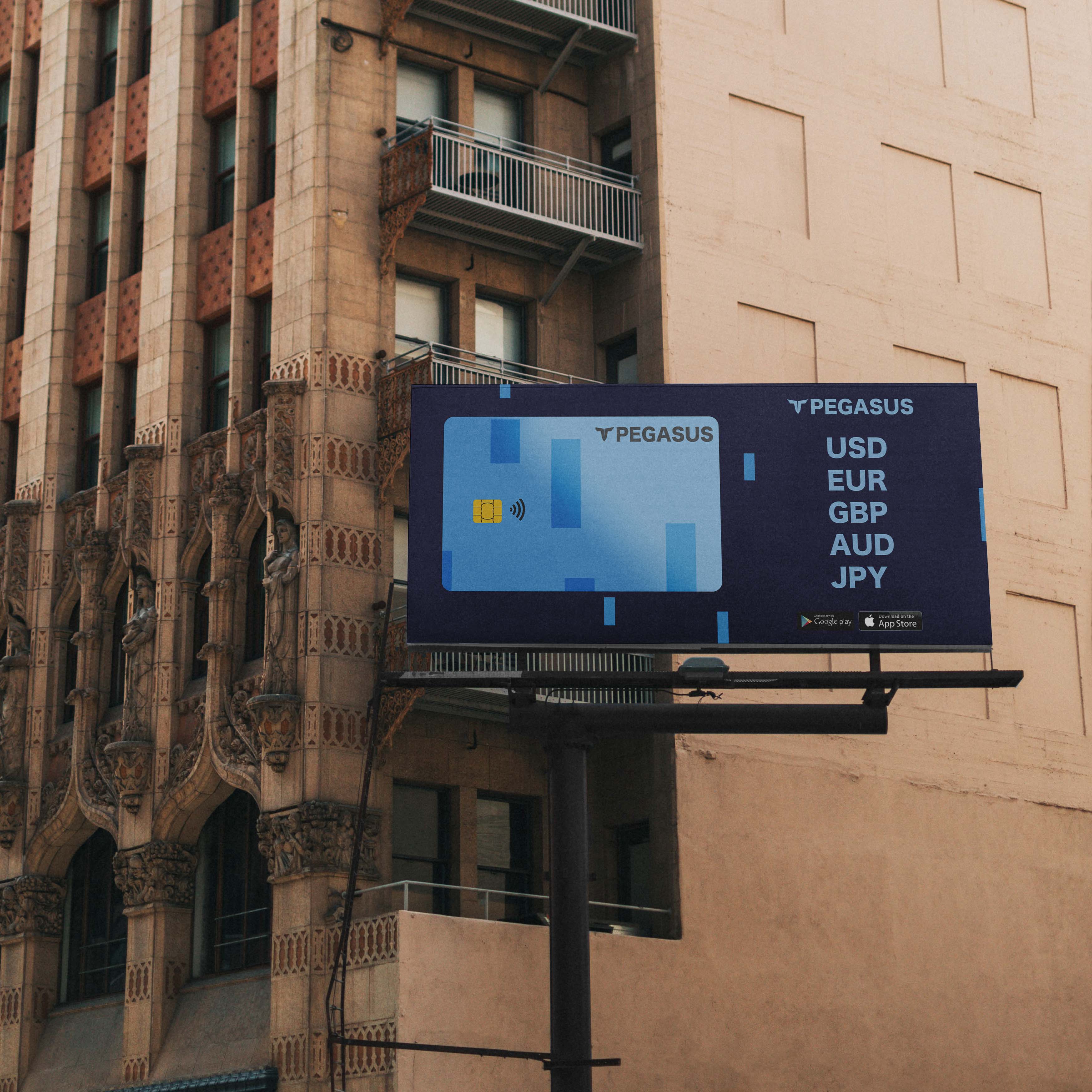
Look & feel
Below, we demonstrate how our brand can be applied. It’s shows how PEGASUS can look like different in diferent media.